BILL HIBBERD ~~~ OIL PAINTINGS OF THE PACIFIC NORTHWEST
  • Paintings
    • Landscapes
    • Seascapes
    • Figurative
    • Still Life
  • About
    • About
    • Biography
    • CV
    • Statement
    • Press
  • Contact
  • Store

Painting Without LinesĀ 

5/26/2012

3 Comments

 
Picture
Although it is ingrained into our impulses to always begin a painting by sketching in lines that represent the shape and volume of our subject it really isn't necessary.
I am beginning a painting of Jonas by covering the whole canvas with a nice warm neutral. I have made a few initial marks (are these lines?) to locate my subject.

Picture
OK, here I've started pushing paint into the areas I want to get the basic pattern started. It is a bit like carving the subject out of a field of paint. There is no imperative for accuracy at this point.   
Picture
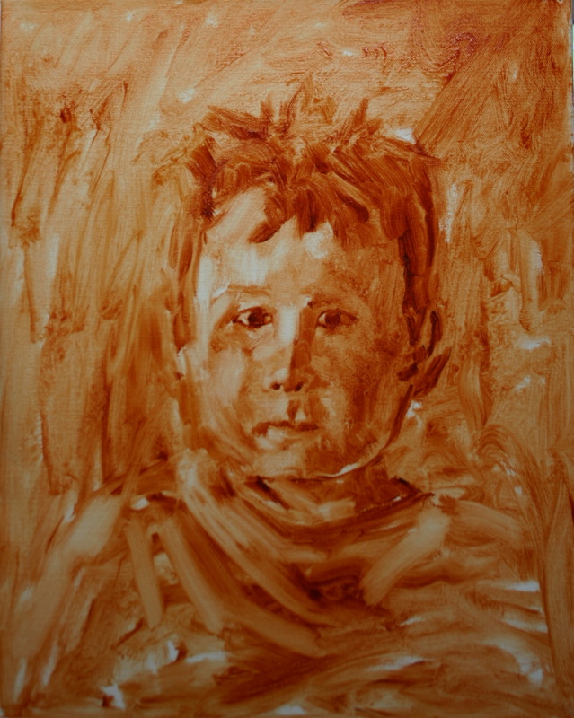
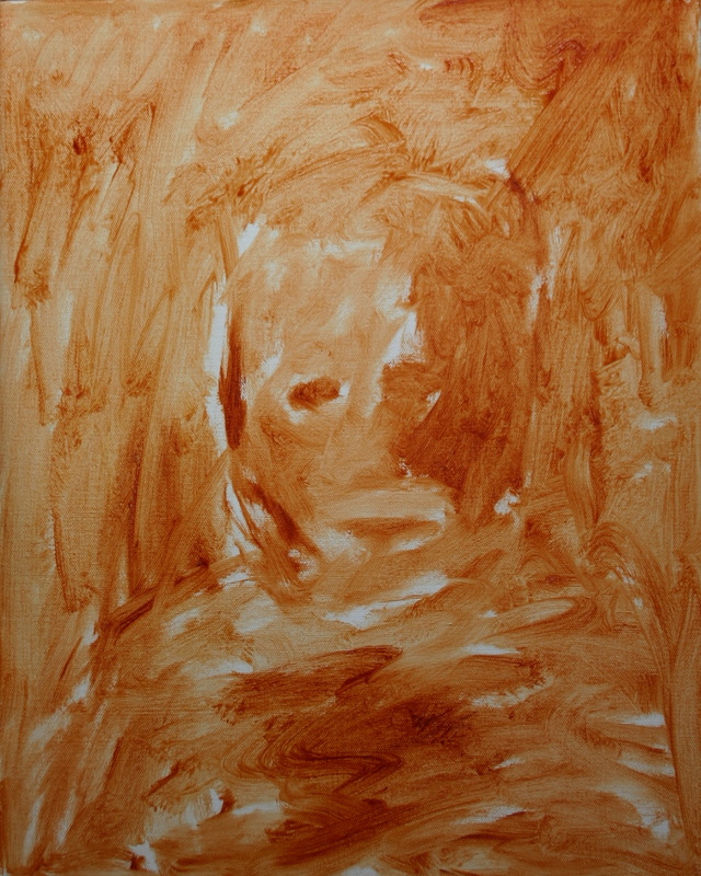
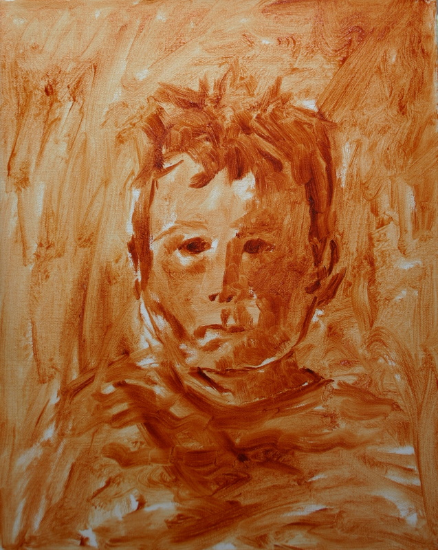
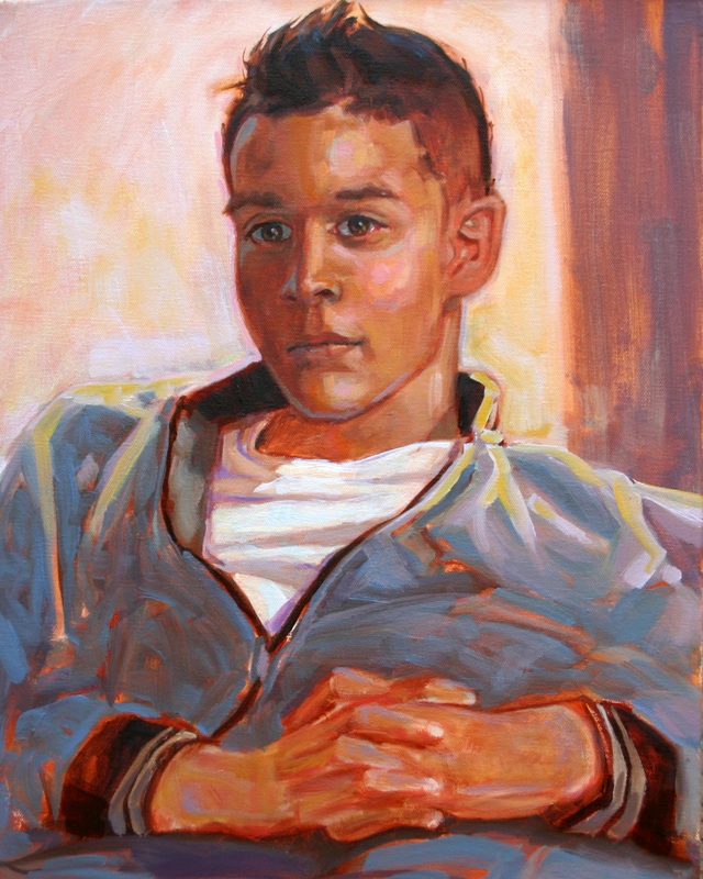
Now I am working in relief, using a small rag that's been dipped in mineral spirits to wipe out areas that need lightening up. Jonas is starting to emerge from the ground. So far I've used a #10 flat brush and a small rag to reach this point.
Picture
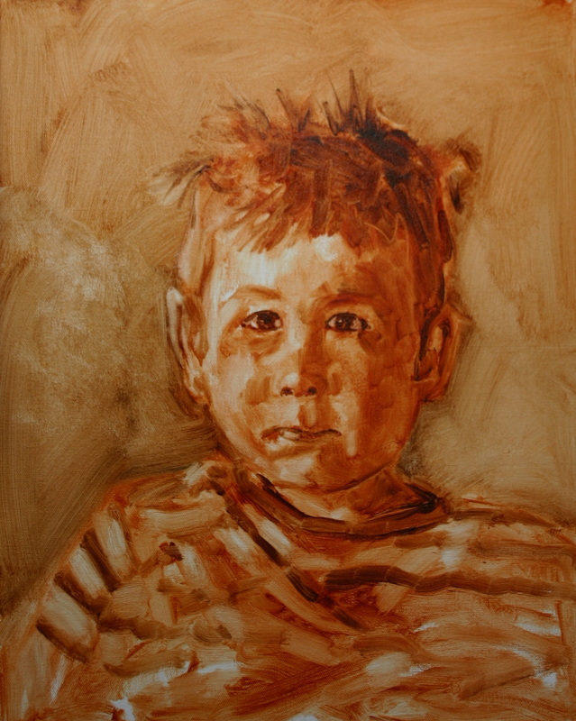
I've introduced ultramarine blue to get some darker values now. A bit of brushwork and this is starting to look like something. This could stand out as a great little study. I quite like paintings at this stage. The trick now is to retain the freshness while adding more elements to make a more interesting picture. 
Picture
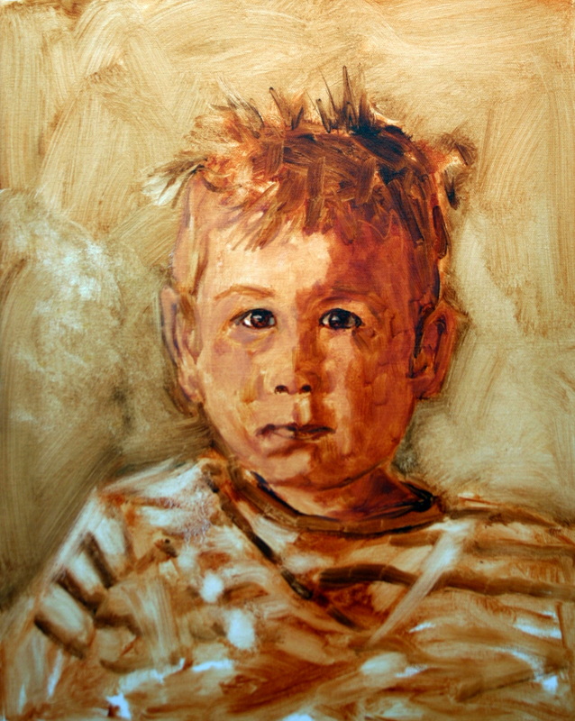
A little work on his features, a little peachy warm colour in the lit skin areas and some high values on his shirt.
Picture
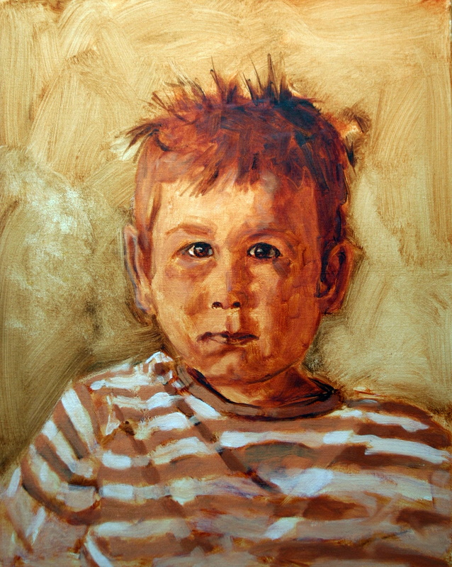
More detail work. A little reflected blues in his hair. More attention to the folds in the shirt.
Picture
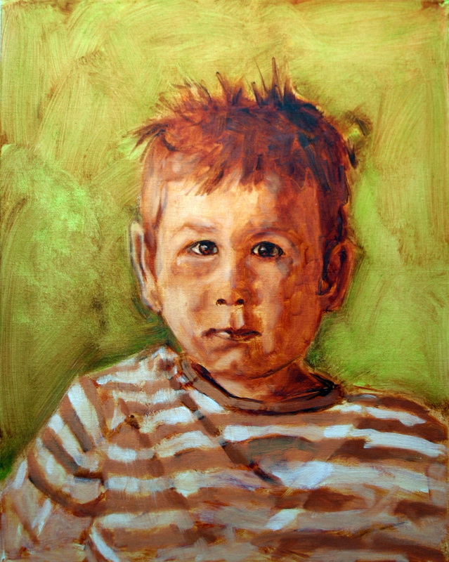
I've scrumbled some viridian over the background. This allows some ambiguous earth reds to show through and helps the background to receed. I like using green with children because it is a colour that symbolizes new life and growth.
Picture
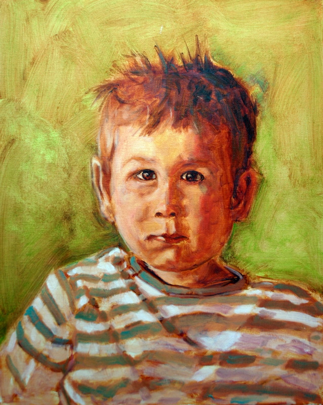
Time to finish this off. I put down some appropriate colours in the shirt, green stripes and subtle violet in the white areas that are out of direct sunlight. I hope you enjoyed seeing the process. Please put any suggestions in my comments if there is an aspect of my painting process that you'd be interested in learning more about. Until next time.
3 Comments

Studio Trip 2012

5/15/2012

2 Comments

 
Come on out to visit local artists in their studios this weekend. They will be happy to share their process and inspiration with you as you view their new work. Go to www.studiotour.wordpress.com for details. I'll have some of my portraits on hand as well as Okanagan landscapes. Hope to see you.
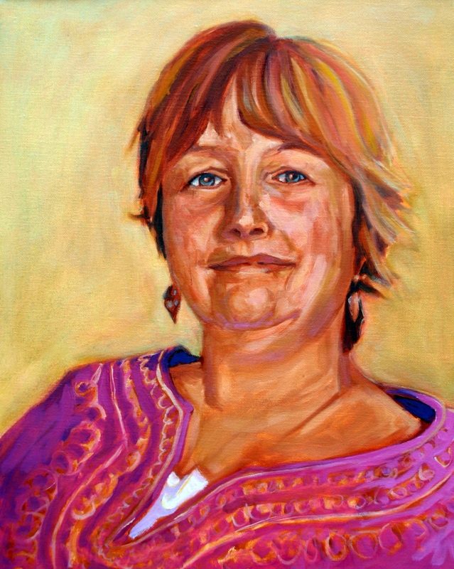
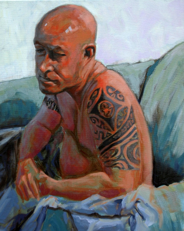
I
2 Comments

Open Studio Tour Coming.

5/3/2012

3 Comments

 
I am taking part in an open studio tour on the 19 and 20th of May.  That is giving me the motivation to refresh my studio space, so I have decided that new paint is in order.  Presently my studio/gallery is painted a great green that does compliment most artwork very well, but is a bit dark when working on portraits inside.  I think I will go with a more traditional gallery white so I can control my lighting more effectively.  You are invited to come out, see some new paintings, and inspect my renovation.  I will get the tour info up on my exhibits page. See http://studiotour.wordpress.com/ 
I am soldiering on with my portraits, so I'll share a few recent ones with you. . .


Picture

Here is Carol.  I am still painting in the same size but have flipped my canvas' into a vertical format.
This gives opportunity to try different compositions from what I have been working on in the horizontal.  This one is pretty straight forward.  I have placed Carol slightly off centre with pretty even light falling across most of her face.
I would describe this one as a high-key painting.  The shadowed areas are pretty high value with plenty of reflected light bouncing into them.
I chose to introduce some low value areas on each side of her face in order to accentuate her left earring  and balance the composition on her right side.


Picture


Torin is set up in artificial lighting because the outdoor lighting was too unreliable.  I really  do need a proper studio with plenty of north facing windows (whine, whine).
My subject  was a very patient sitter, so I was able to get my head into the final painting early on.  I wanted to introduce his hands as well as his casual posture.  I think it all hangs together pretty well.


Picture


Steve was a good sport on this one.  I really enjoyed working with him.  His tats have great significance for him, so I wanted to make them a big part of this piece.  I did have to respect the tattoo artist's copyright, so I kept things vague but recognizable to Steve.
The orange flesh hues are complimented by blue and violet/white in the background.  This thing really "pops".  
3 Comments

    RSS Feed

    Categories

    All
    Portraits

    Past blog posts.

    Archives

    July 2017
    June 2017
    April 2017
    March 2017
    February 2017
    January 2017
    December 2016
    November 2016
    October 2016
    September 2016
    March 2016
    January 2016
    December 2015
    April 2015
    October 2014
    September 2014
    June 2014
    March 2014
    February 2014
    January 2014
    December 2013
    November 2013
    October 2013
    September 2013
    July 2013
    June 2013
    May 2013
    April 2013
    March 2013
    February 2013
    January 2013
    December 2012
    November 2012
    October 2012
    July 2012
    May 2012
    April 2012

Powered by Create your own unique website with customizable templates.